
Pipeline Map
What the Pipeline Map shows
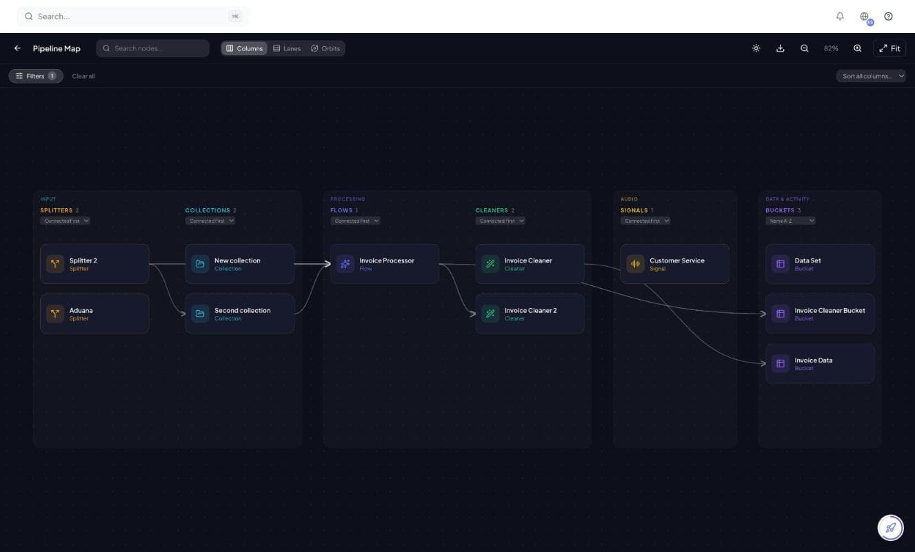
The Pipeline Map draws every object in your workspace as a node and every connection between them as a line. It answers questions that are painful to answer by clicking through detail pages: what feeds this flow, which Cleaner do these two flows share, and which Bucket is nothing writing to.
Open it from Pipeline Map in the sidebar. It is a full page, not an overlay, and it reads from your live configuration — so it is always current rather than a diagram somebody drew once and stopped updating.
Reading the map
Nodes are grouped into stages that follow the direction documents actually travel: everything that brings a document in sits on the left, everything that processes it in the middle, and everything that stores the result on the right.
| Stage | Contains | What a line into it means |
|---|---|---|
| Input | Splitters and Collections | Documents arrive here first, to be split apart or classified. |
| Processing | Flows and Cleaners | This flow receives documents from that Collection or Splitter; this Cleaner sweeps that flow's output. |
| Data & activity | Buckets | This flow or Cleaner writes its results into that Bucket. |
Each group shows a count, and each can be sorted — Connected First pushes the wired-up nodes to the top so the unconnected ones stand out at the bottom. Clicking any node opens its detail page.
Three layouts
The same graph can be drawn three ways. Switch between them from the toolbar; none of them changes your configuration, only how it is arranged on screen.
| Layout | Best for |
|---|---|
| Columns | The default. Reading the pipeline left to right as a sequence of stages — the clearest view for explaining the setup to someone else. |
| Lanes | Following a single path through the workspace when many objects share the same stage. |
| Orbits | Spotting the busiest hubs — which flow or Bucket everything else clusters around. |
Finding things in a large workspace
Once a workspace has a few dozen objects the whole graph stops fitting on screen. The toolbar has the tools for that: search, filters, zoom and a fit-to-screen control that frames everything at once.
- Search nodes by name to jump straight to one
- Filter the map down to the object types you care about — the toolbar shows how many filters are active, with a one-click Clear all
- Zoom in and out, or use Fit to frame the whole graph
- Export the map as an image when you need it in a document or a review
Sort each group by Connected First and read the bottom of each column. A flow with no Cleaner and no Bucket is throwing its results away unless something is collecting them over the API; a Bucket with nothing pointing at it is only being written to by hand.
When the map is worth opening
The map is a diagnostic tool rather than something you use daily. It earns its keep at the moments when you need to understand the shape of the workspace rather than the contents of one run.
- Before deleting anything — the map shows what else is wired to it
- When a document ends up in the wrong place and you need to see the routing path it took
- When onboarding someone, as a one-screen explanation of how the workspace fits together
- After a build-out, to check nothing was left unconnected
- When two teams have each configured flows and you want to find duplicated work
The map shows how things are connected, not how much is flowing through them. For volumes, credits and failures, use the Runs list and each object's own activity history.